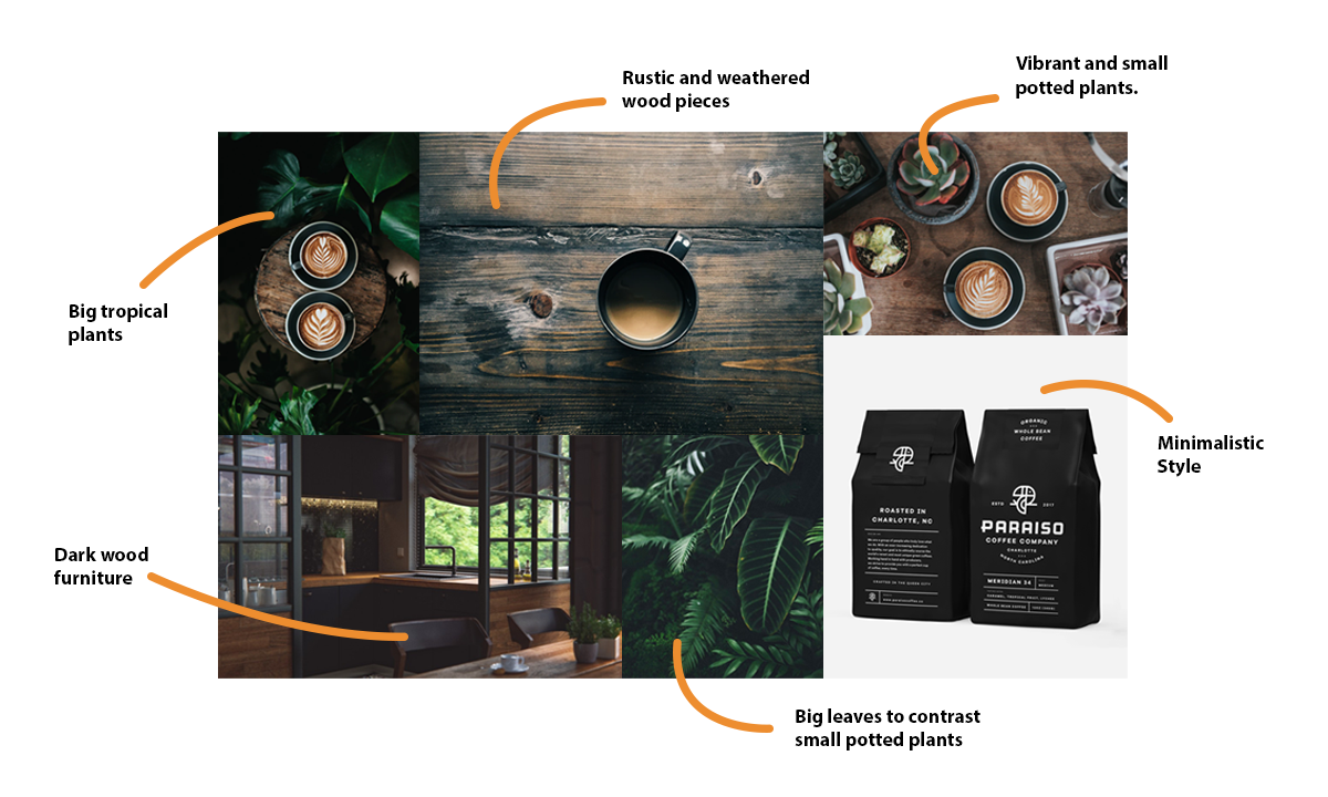
Toucups of Coffee started as a project in college. Students were given the option to create an imaginary business of their choice. Long nights during college pushed me to create a brand around a popular drink. Coffee. I have done some research on brands circulating around toucans, the concept of paradise, and other brands of coffee to see which worked best! One project really struck me truly inspiring, Ryan Prudhomme's brand called Paraiso Coffee Company. It was simple yet there is enough attention to detail to give the audience enough information on the brand. I absolutely loved the look but I also wanted to incorporate more colors into Toucups.
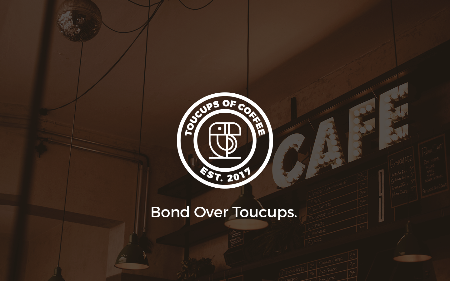
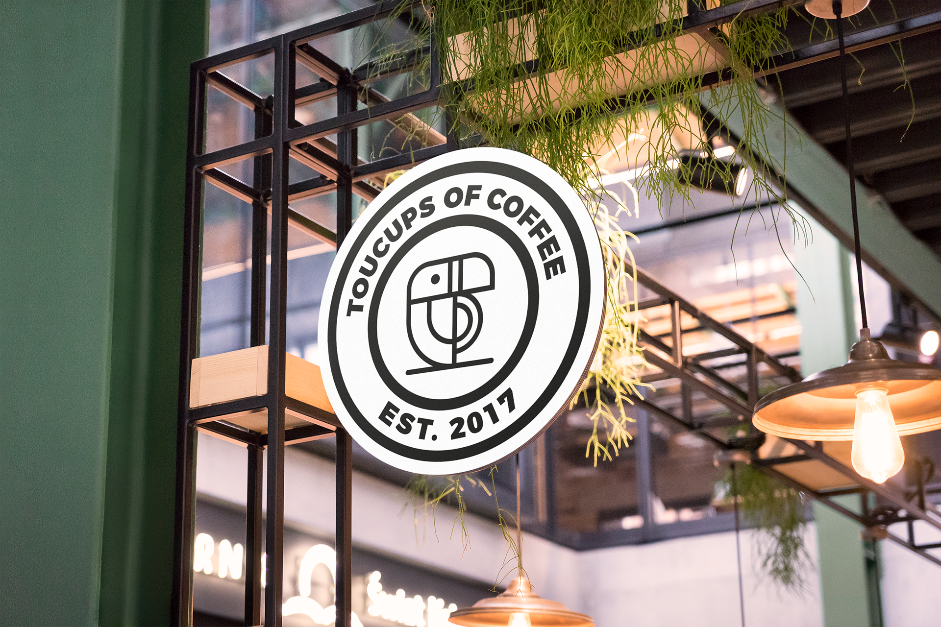
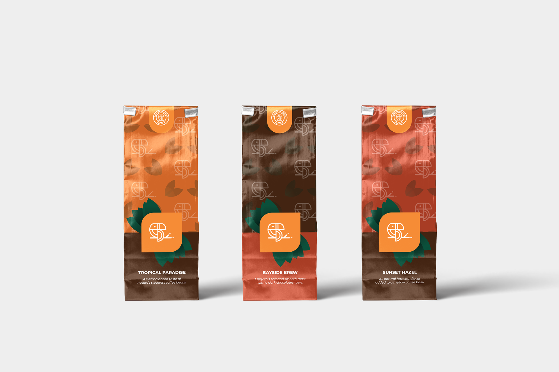
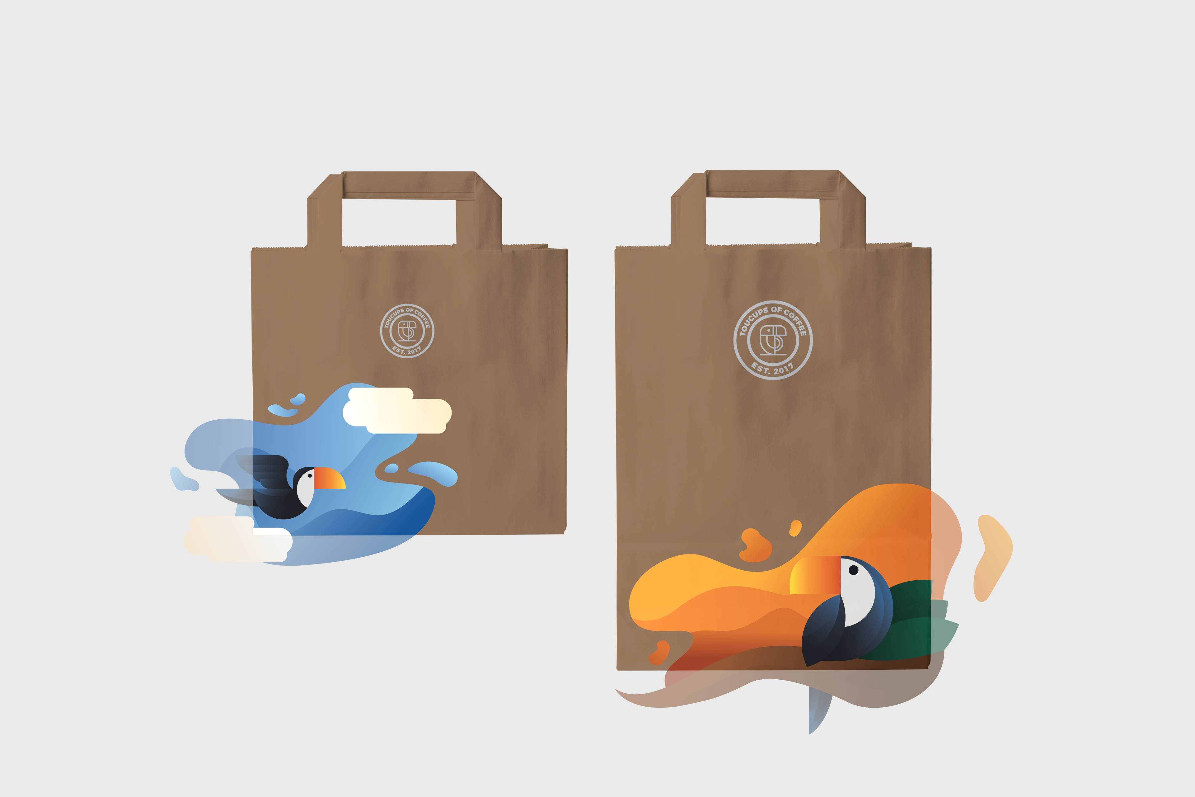
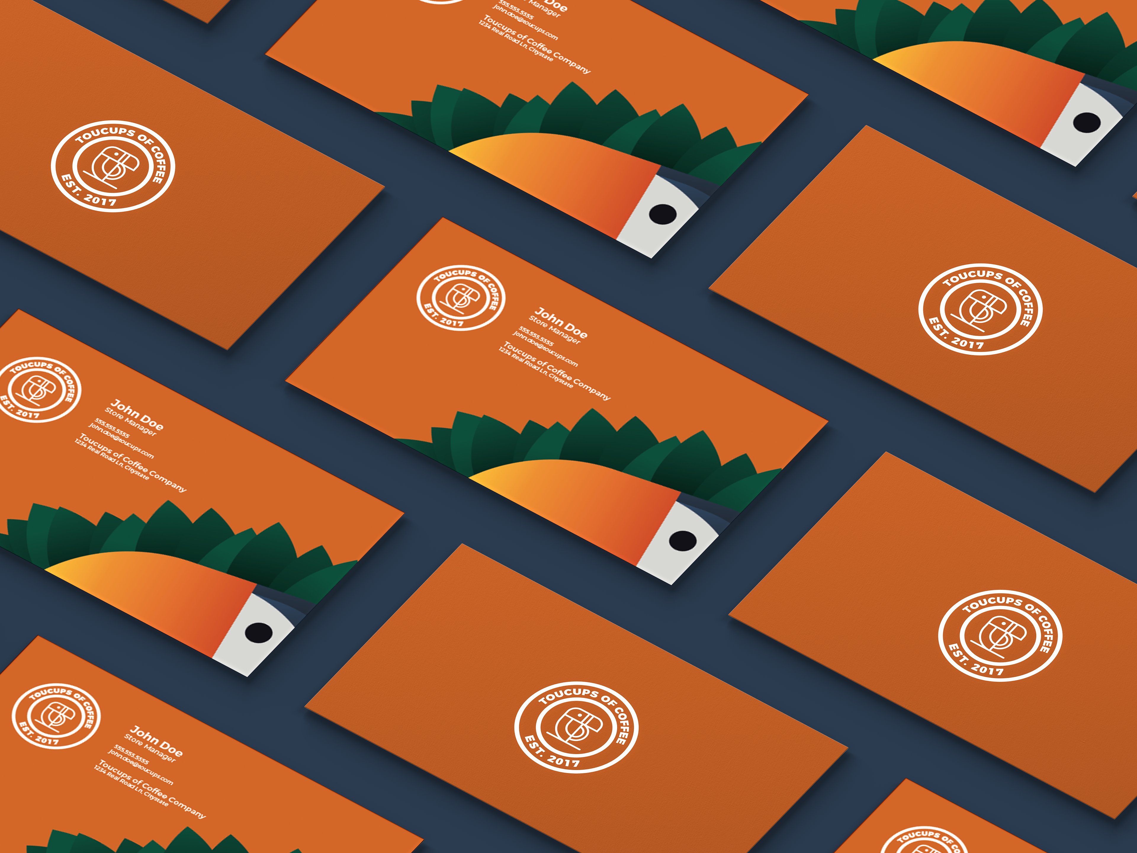
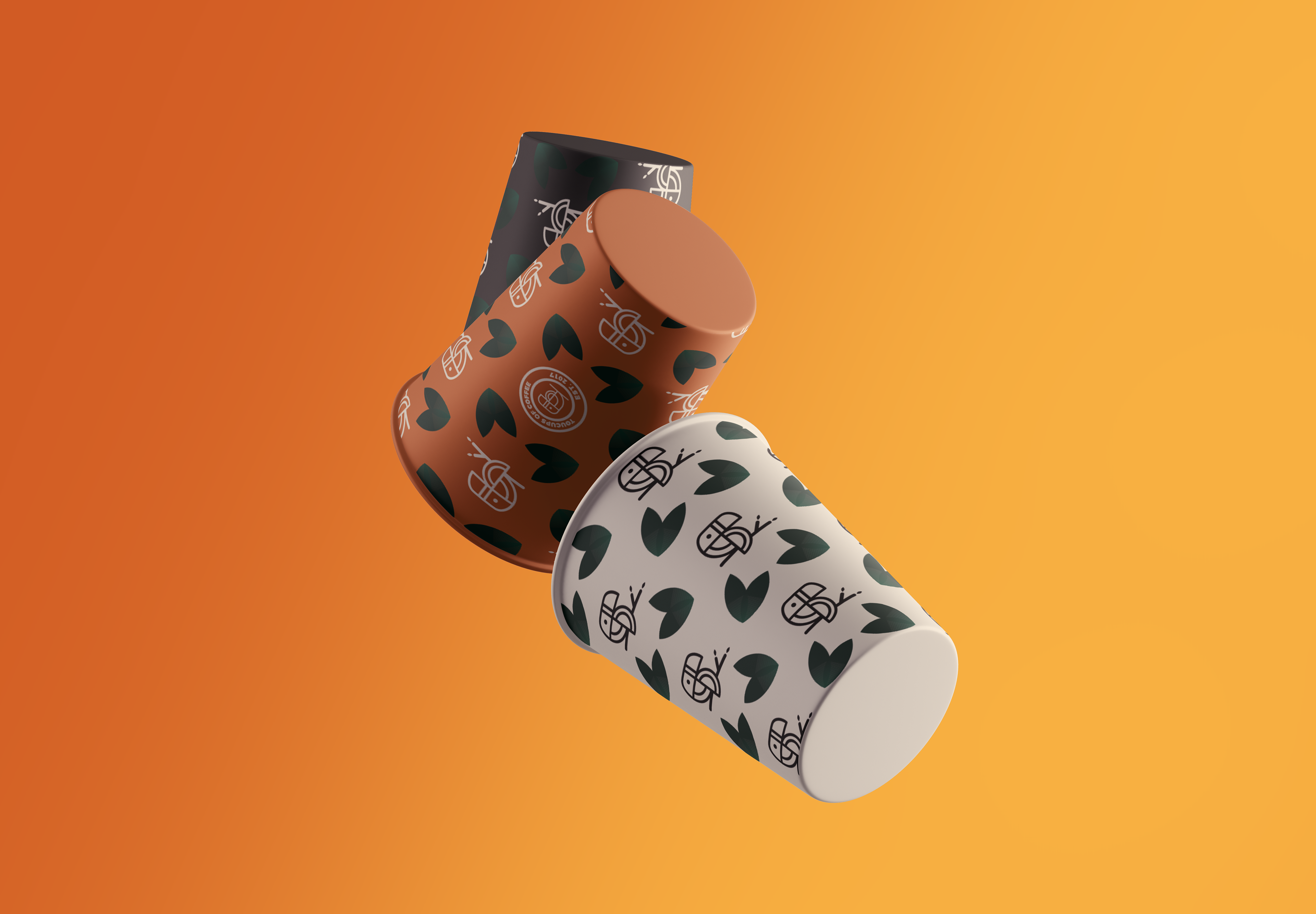
The brand itself was based around the feeling of bonding, even if it meant yourself. Enjoying time with yourself or with someone gives the sense of relaxation and comfort. These two words are what the brand circulates around. The logo previews a mix of a Toucan and a cup of coffee.
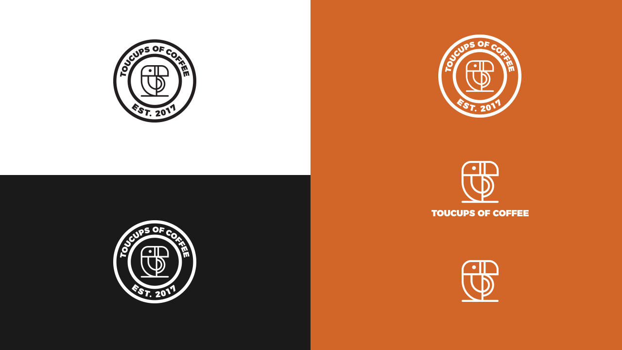
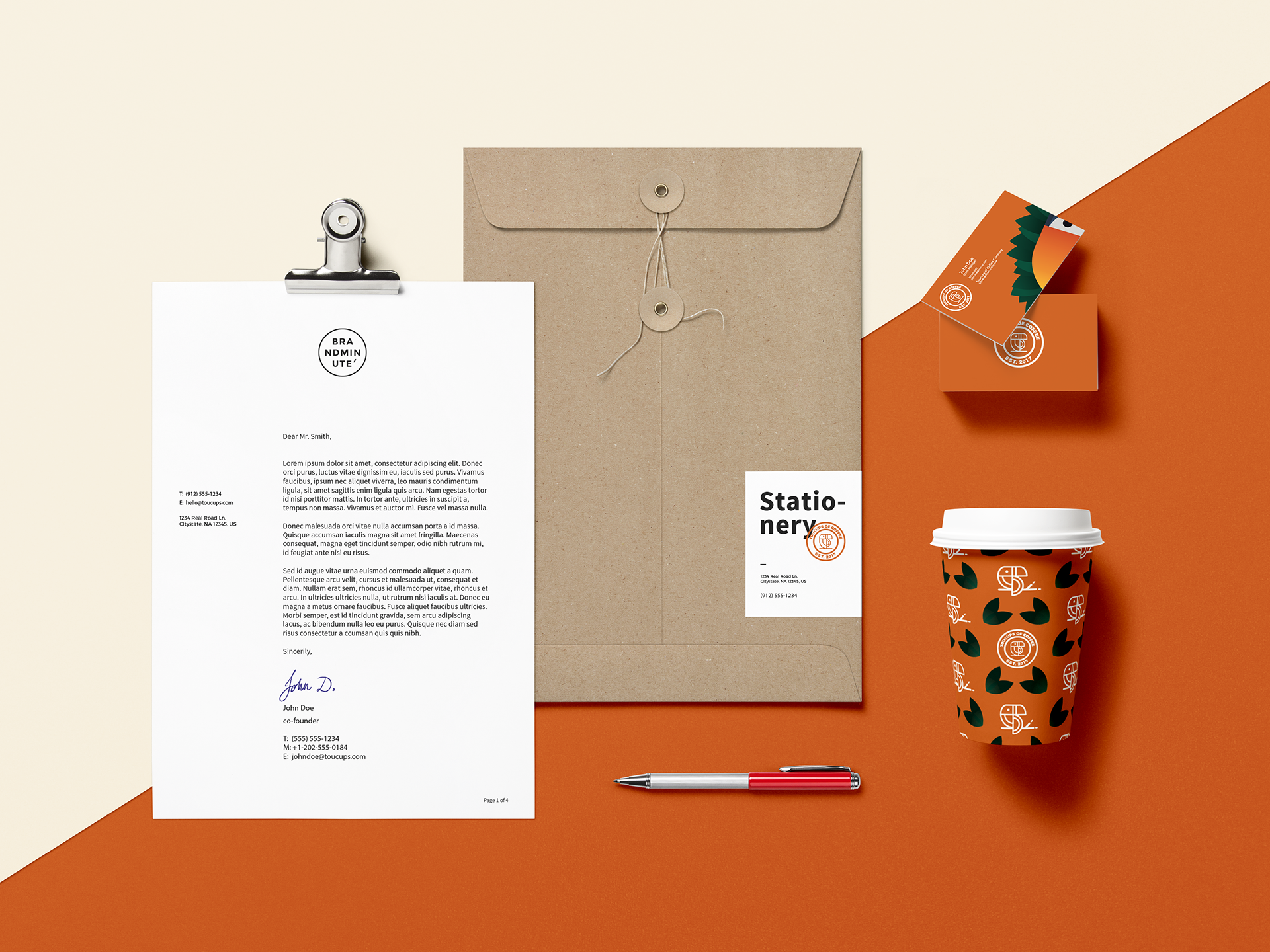
The branding I had in mind were full of illustrations and patterns. The main colors of the brand is orange, brown and blue. Hints of green were added to create an accent in the designs. The atmosphere given in the shop and by the branding was to keep an excitable look but also create a space where it doesn't overwhelm the customer.
Thank you for taking your time to view my project.