An Exploration of Minecraft Dungeon's UX/UI
Overview
An in-depth analysis of Minecraft Dungeon's UX and UI Design applied to Elden Ring's UI Visual Direction and style . This project is designed to help understand the entire process that involves UX/UI from both the game designer's intention and the player's perspective.
Roles and Responsibilities
I was tasked to study, understand, and build upon the UX Design process implemented in Minecraft Dungeons and apply that knowledge with Elden Ring's Visual Direction. I designed the User Experience and Interface layout through Figma and creating the visual style through Adobe Photoshop and Illustrator.
Tasks
UI Design - Figma
UI Art - Photoshop/Illustrator
UX Research and Testing
Prototyping
Length of Project
7 Weeks
Challenges
- Limited understanding of the player's experience in games
- Creating and conducting a valuable User Experience Research and Testing
- Developing a brand's familiar and distinguished visual style
Work Process
Player Journey
Paper Prototype and Flowchart
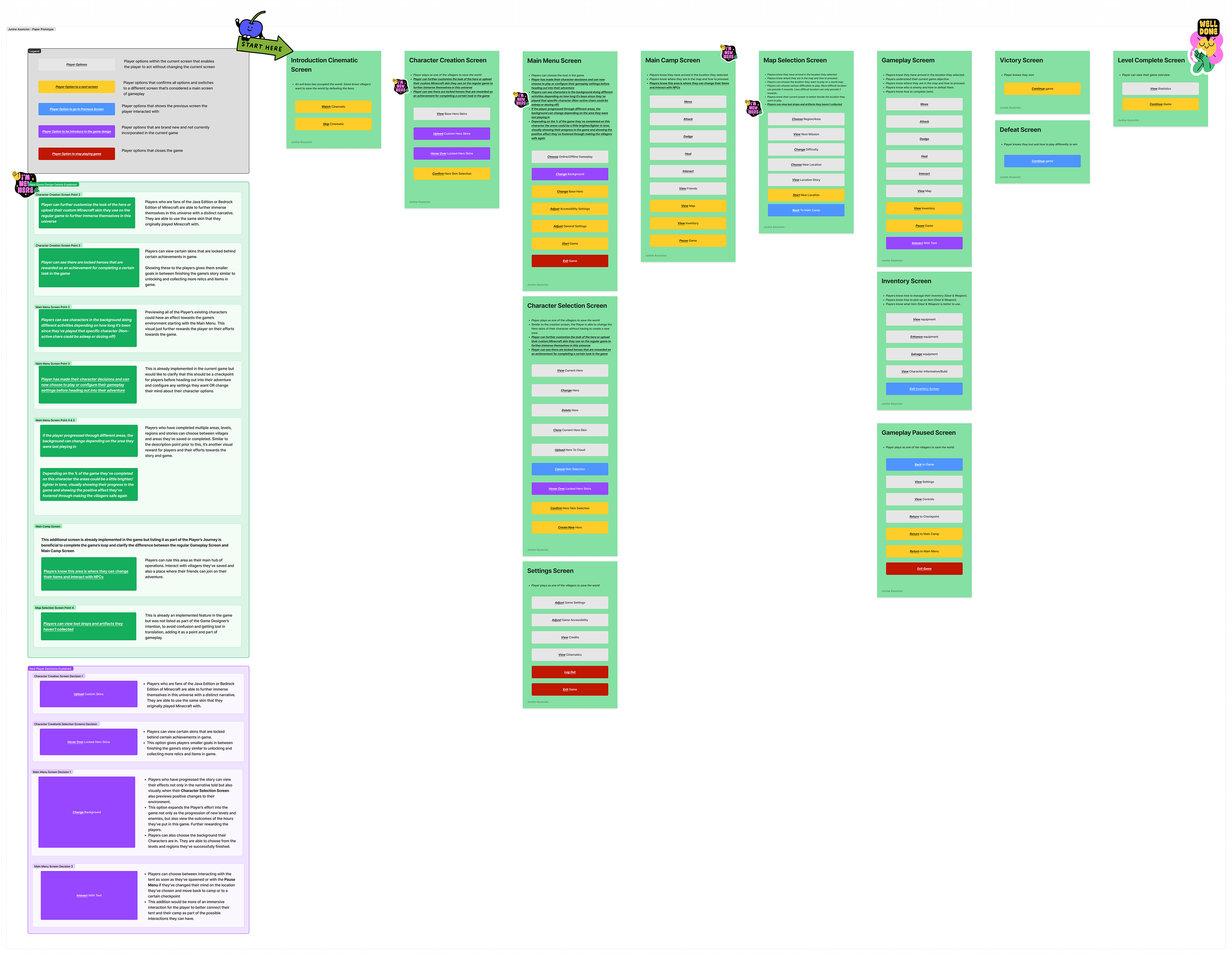
Paper Prototype
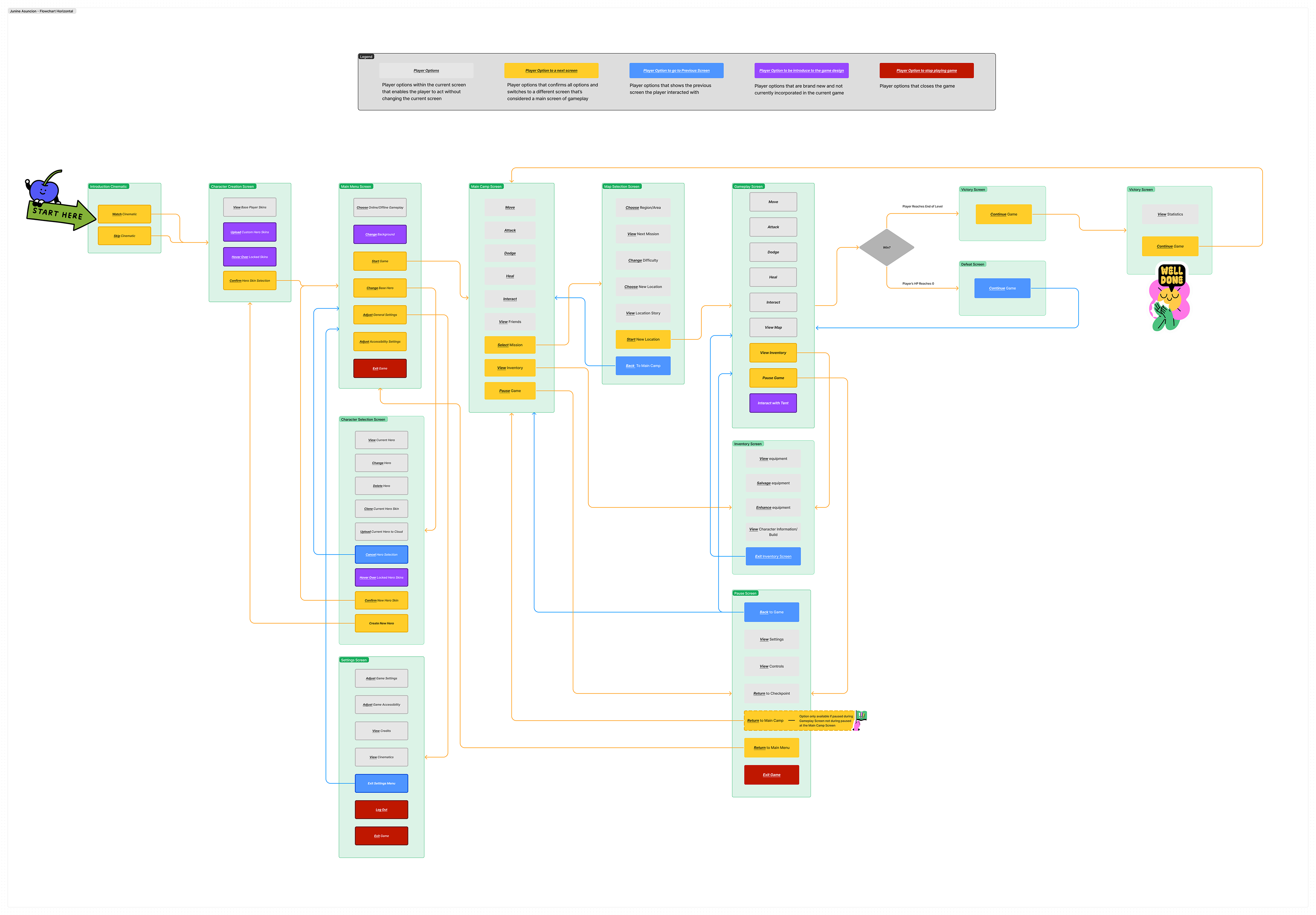
Flowchart
Wireframes and Usability Test
Initial Wireframes
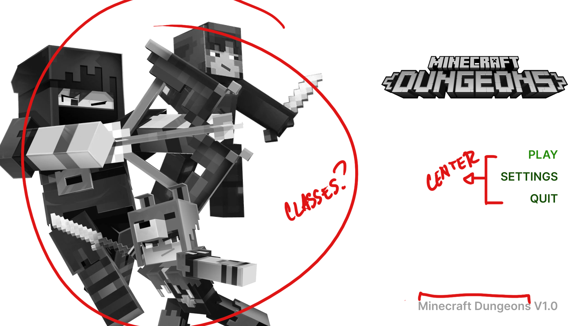
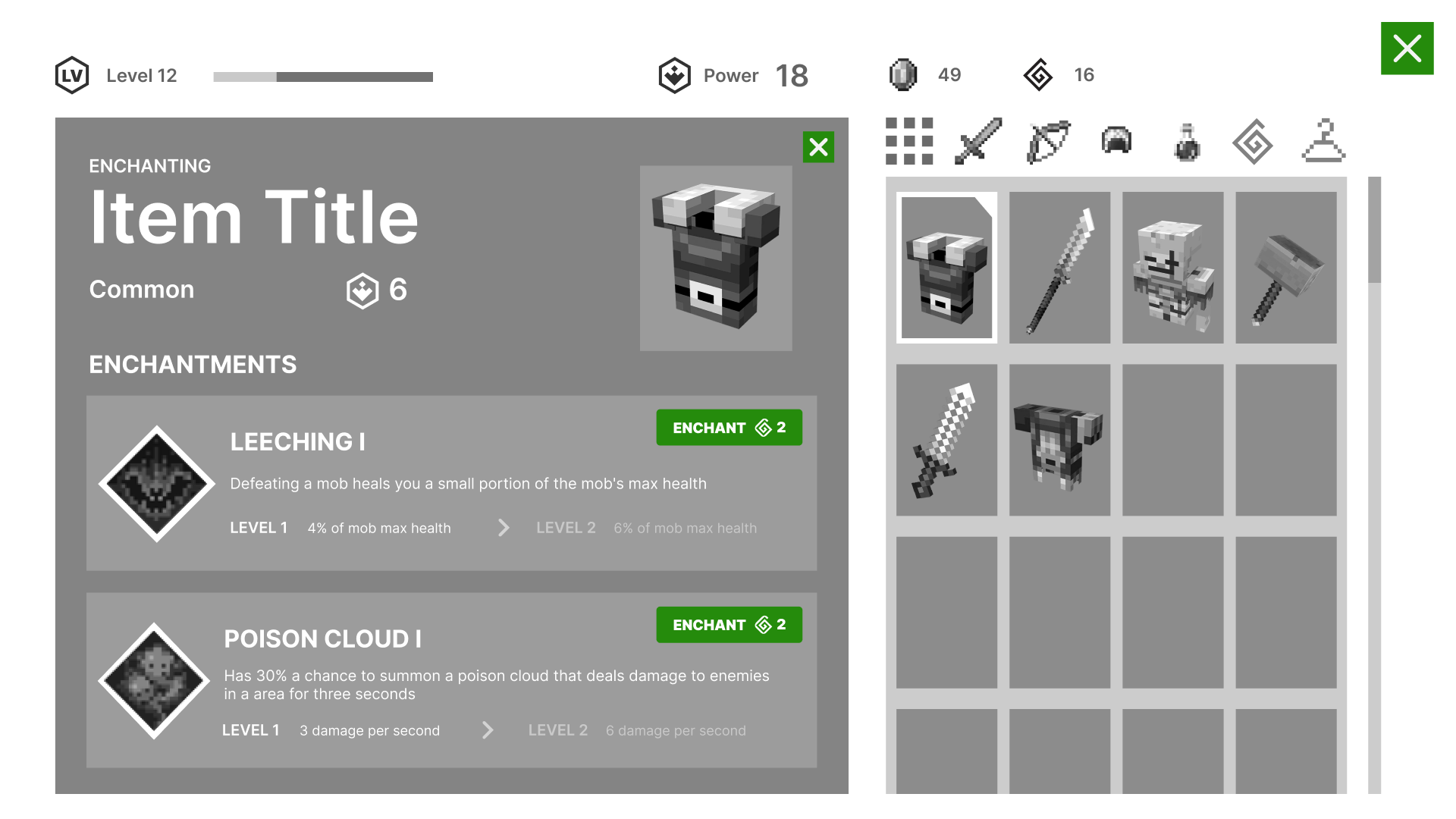
Enchanting Screen
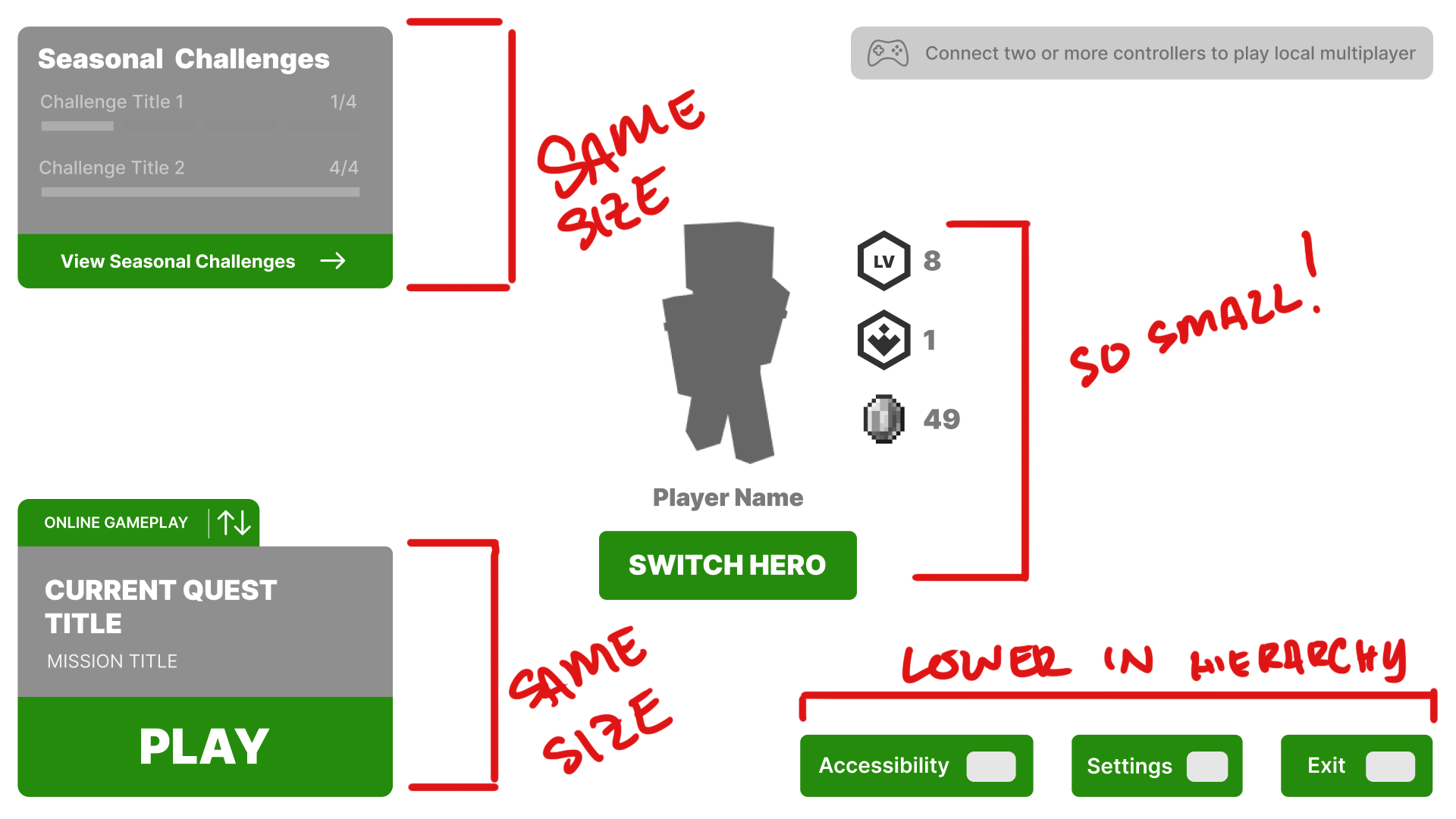
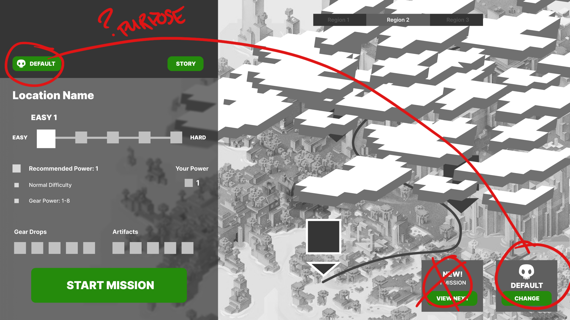
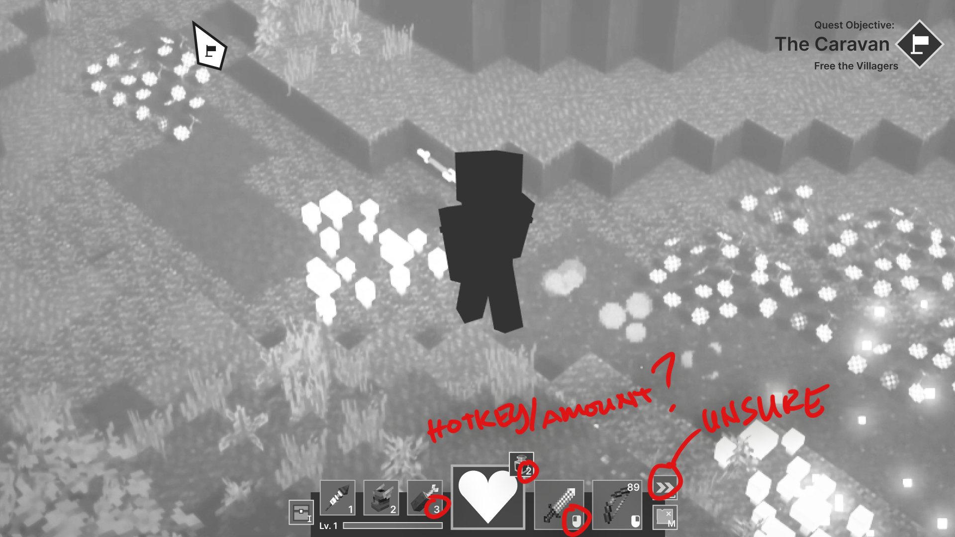
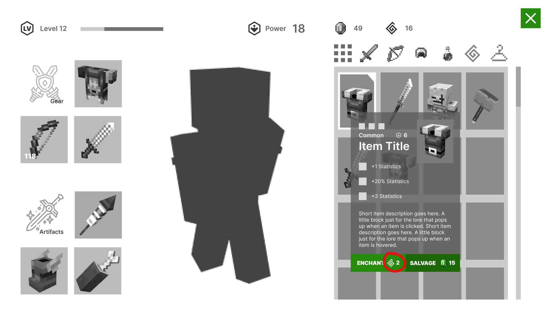
Through the User Research and Testing, the options for each screen were adjusted to better inform the player on the options available without overwhelming them either through visual hierarchy in size, contrast, color, or placement and adding extra clarification through additional hotkey placements and better iconography that players can easily and quickly understand. Some users came to a predetermined expectation in the game that the game did not offer. Adjusting the image led to the testers having a better scope of what the game actually offers.
Iterated Wireframes
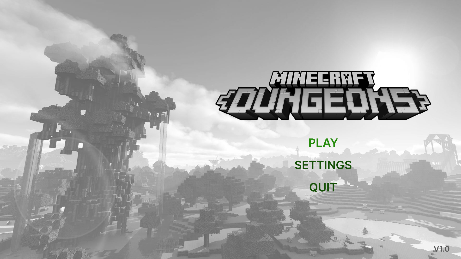
Home Screen
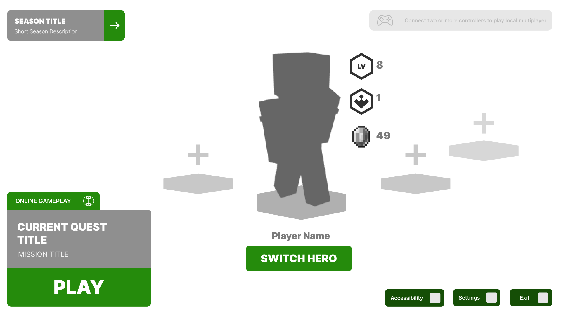
Gamemode Select Screen
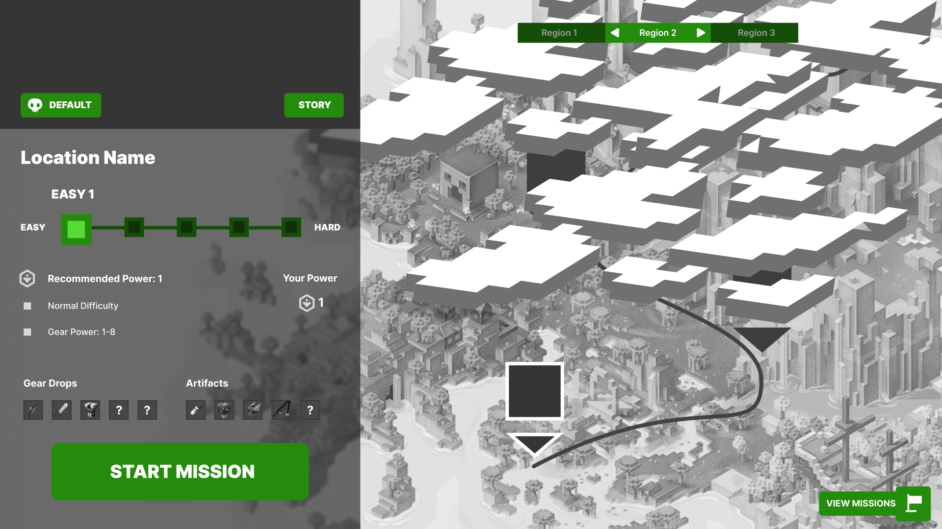
Map Selection Screen
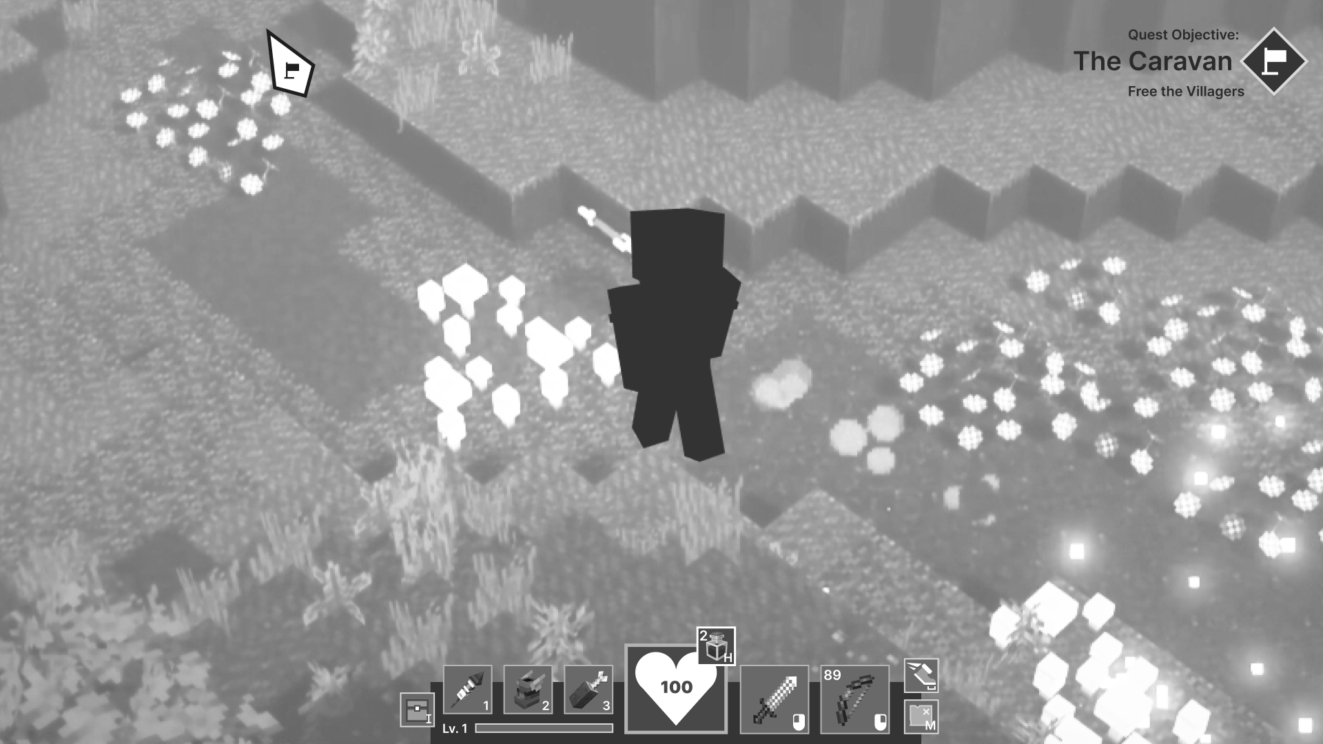
Gameplay Screen
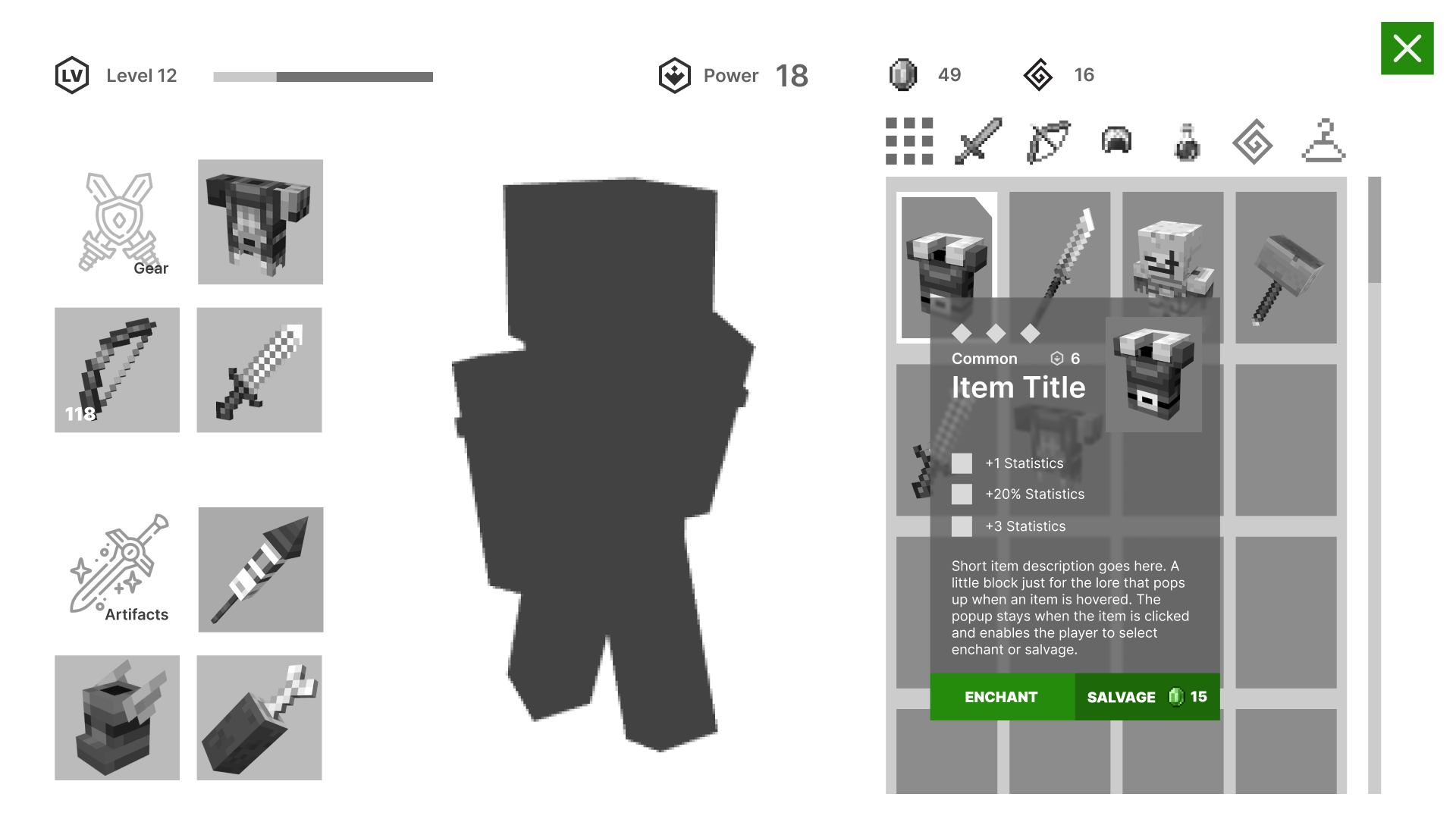
Inventory Screen with Tooltip
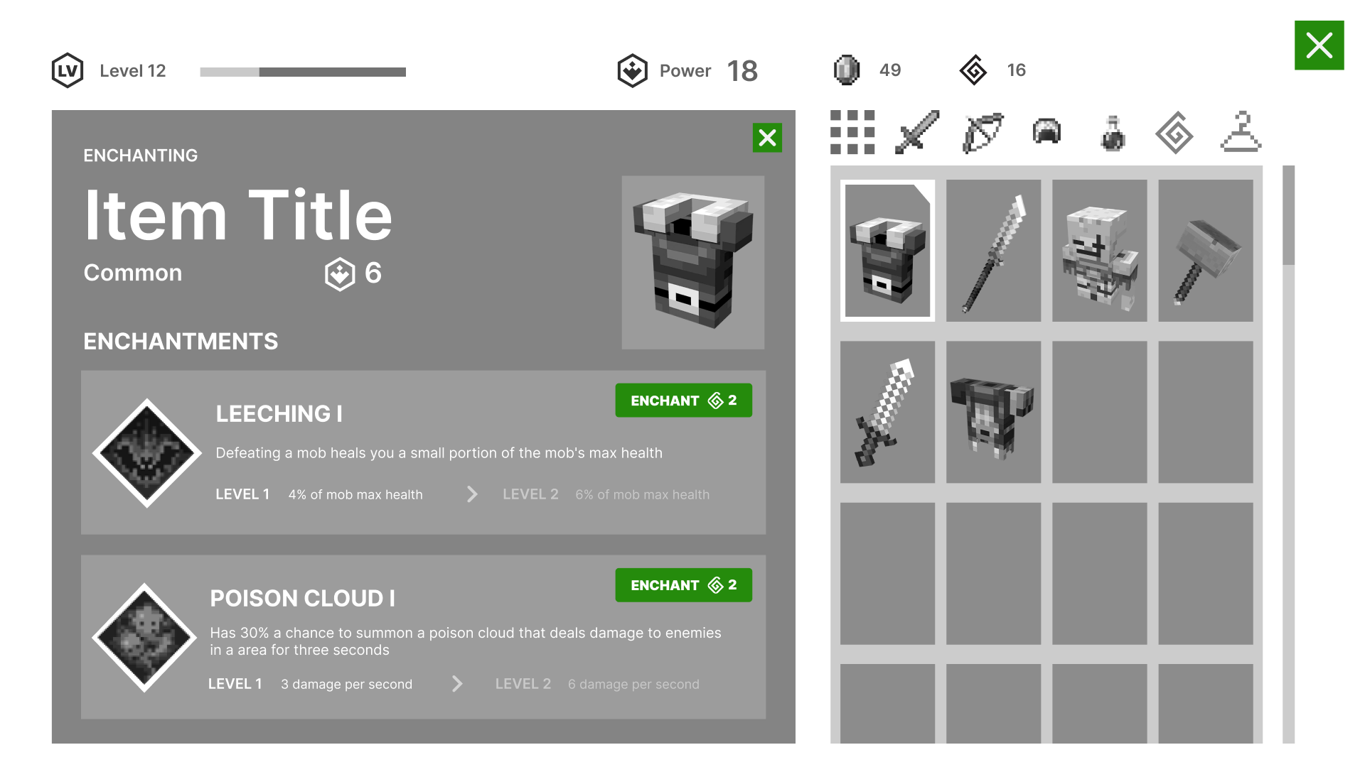
Enchanting Screen
UI Moodboard and References
After designing the wireframes based on Minecraft Dungeon, I chose to implement Elden Ring's Visual Style into the layout.
UI Styleguide and Mockups
UI Styleguide
UI Mockups
Home Screen
Gamemode Select Screen
Map Selection Screen
Gameplay Screen
Inventory Screen. Character created by Wil Xan Phuah on Artstation.
Enchanting Screen
Accessibility
The mockups were put through 8 different color blindness tests to ensure visual clarity across different users.
Outcomes
- Understood both the player's expectations and game designer's intentions to create a complete picture that balances both aspects in the game
- Applied UX Research and Testing to better enable the player to act on their desired options in the game
- Developed a UI Styleguide that helped create a cohesive design throughout the UI Wireframes and Mockups
Post Mortem
Through this project and course, I have a better grasp of just one of the many branches in design for the gaming industry. Learning the player's experience and also understanding the game's design to create a balance that is both fun and true to the game designer's intention has been a wonderful experience.

